KLYMB
Fitness apps feel like homework.
Most fitness apps fall into one of two failure modes — either they're too clinical (dashboards that look like hospital software) or too gamified (XP bars and streaks that make you feel guilty the moment you skip a day). Neither one makes you want to open the app at 7am when motivation is at zero.
KLYMB is built around a different question: what would a fitness app look like if it was designed for the days you almost didn't open it?
From zero to product.
I joined KLYMB as a founding team member and Product Designer. There was no existing design system, no brand, no UI — just an idea and a whiteboard. Everything you see is built from scratch.
- Full App UI — onboarding flows, daily tracking, progress screens
- Share Cards — a social accountability feature I conceived and designed
- Icon System — custom iconography for all activity categories
- Avatar Illustrations — personalised user avatar set
- Brand Identity — logo, typography, color system
- Web UI — marketing website concept (not yet shipped)
- Product Strategy — contributing to feature decisions and roadmap
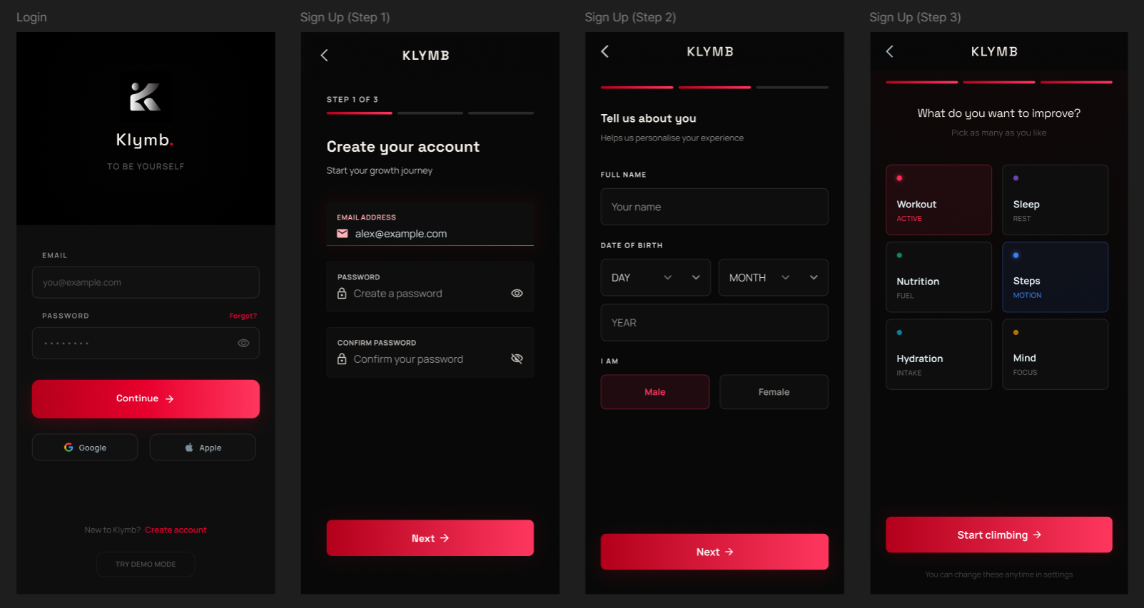
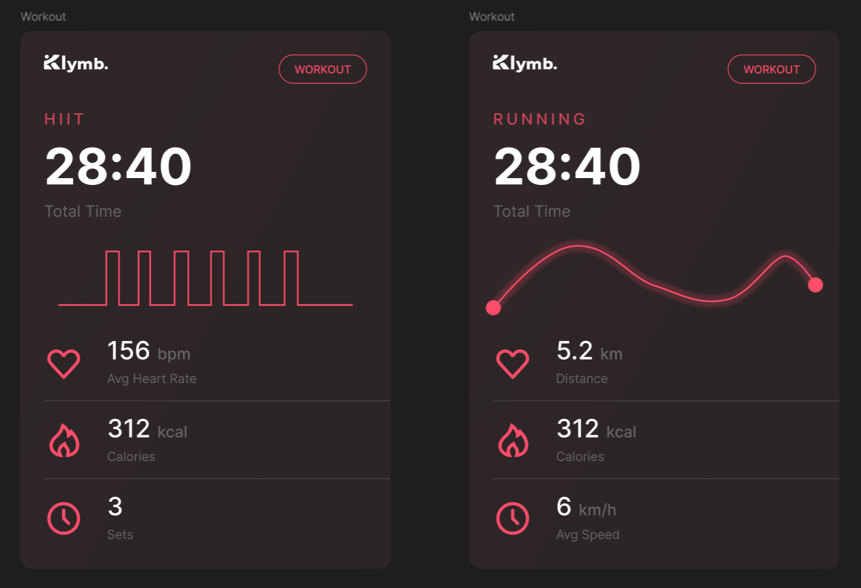
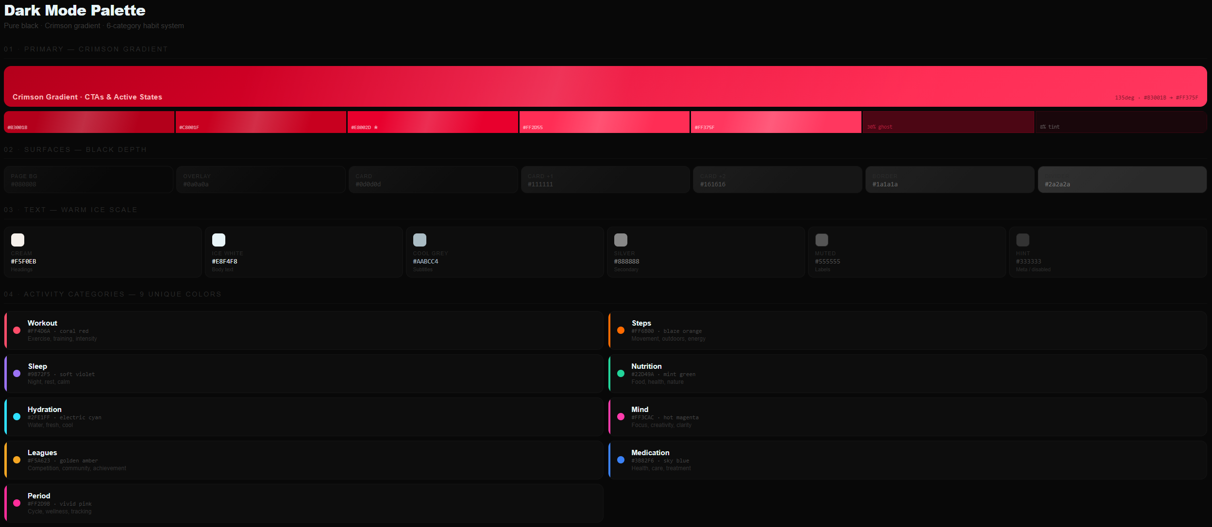
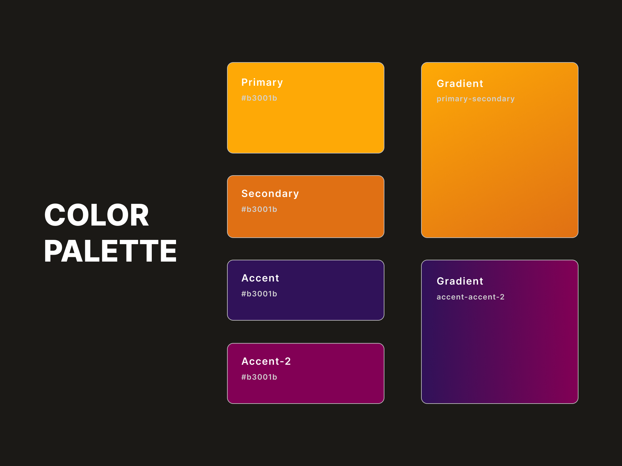
Dark by default. Crimson on black.
The color system was designed to feel premium, high-energy, and personal — dark backgrounds that make the interface recede, leaving only your data and progress front and center. The crimson gradient serves as the single energetic signal: CTAs, active states, streaks.
Each habit category has its own color — workout, sleep, nutrition, hydration, mind, leagues — so at a glance you can see your whole day in one ring chart without reading a single label.
Design for the low-motivation moment.
Every screen was stress-tested for the hardest moment — not when you're motivated and energized, but when you barely picked up your phone. That meant reducing friction to near zero: one-tap logging, no onboarding friction after day one, progress that feels good even when it's incomplete.
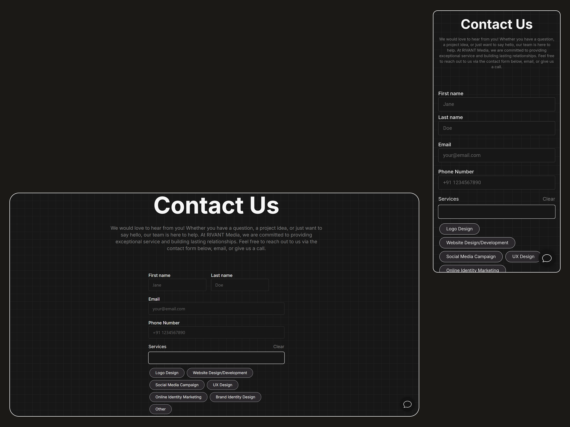
The Share Cards feature came from a specific observation: people screenshot their progress and send it to friends anyway. Why not make that intentional? A designed artifact that's worth sharing — not just a data dump.