Design Assignment
Candidate Screening
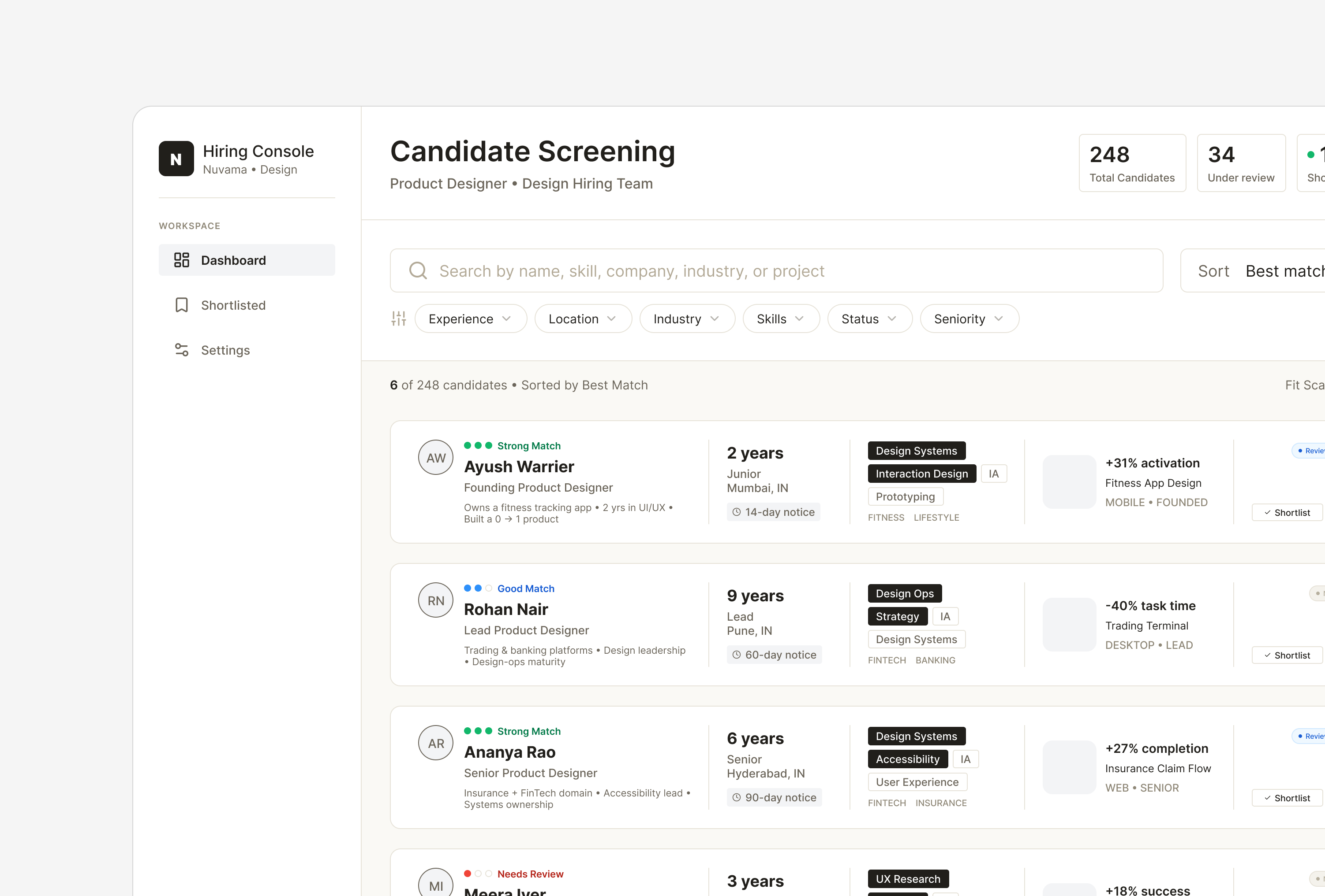
A recruiter dashboard designed for the UI/UX Design Intern assignment at Nuvama Wealth. The challenge was to help hiring teams review hundreds of candidates faster without losing important portfolio context.
What the brief asked for
The design team is hiring and has hundreds of designer applications to get through. Each one arrives as a resume, a portfolio link and a scatter of experience markers. They needed one central dashboard to filter, sort and shortlist against several criteria at once.
-
01Overloaded profiles
Too much unstructured information to find the qualifications that matter.
-
02Inconsistent skills
Every resume words the same skill differently, so nothing compares.
-
03No portfolio context
Projects rarely say what the candidate actually did, so screeners guess.
-
04Buried experience
Domain experience like design systems or fintech means digging through resumes.
-
05Invisible visual quality
No design samples in the profile, so judging craft takes extra steps.
-
06No cue for fit
Nothing shows how closely a candidate matches the role criteria.
Design a dashboard UI that lets the design team solve all six.
Designing for how recruiters actually review candidates
Compare first. Read later.
Recruiters rarely evaluate one person in isolation. They compare multiple applicants quickly, looking for patterns before reading details.
Traditional cards waste space, while spreadsheets remove portfolio context.
I designed a structured list that combines the speed of a table with enough visual information to judge design experience, skills and real work at a glance.

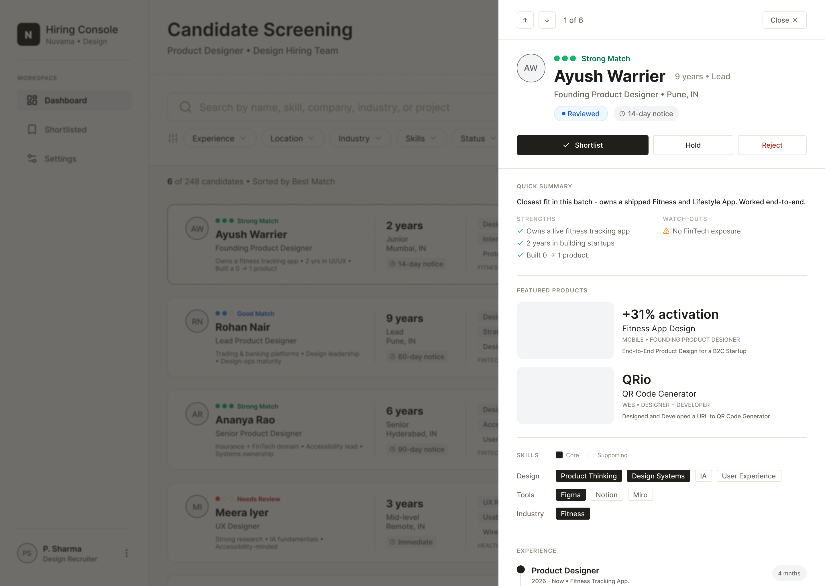
Keep recruiters in context.
Opening a separate profile for every candidate breaks flow and resets scroll position.
Instead, I designed a side panel that lets recruiters inspect one candidate while keeping the list visible underneath.
Closing one profile and opening the next becomes almost effortless.
From Structure to Interface
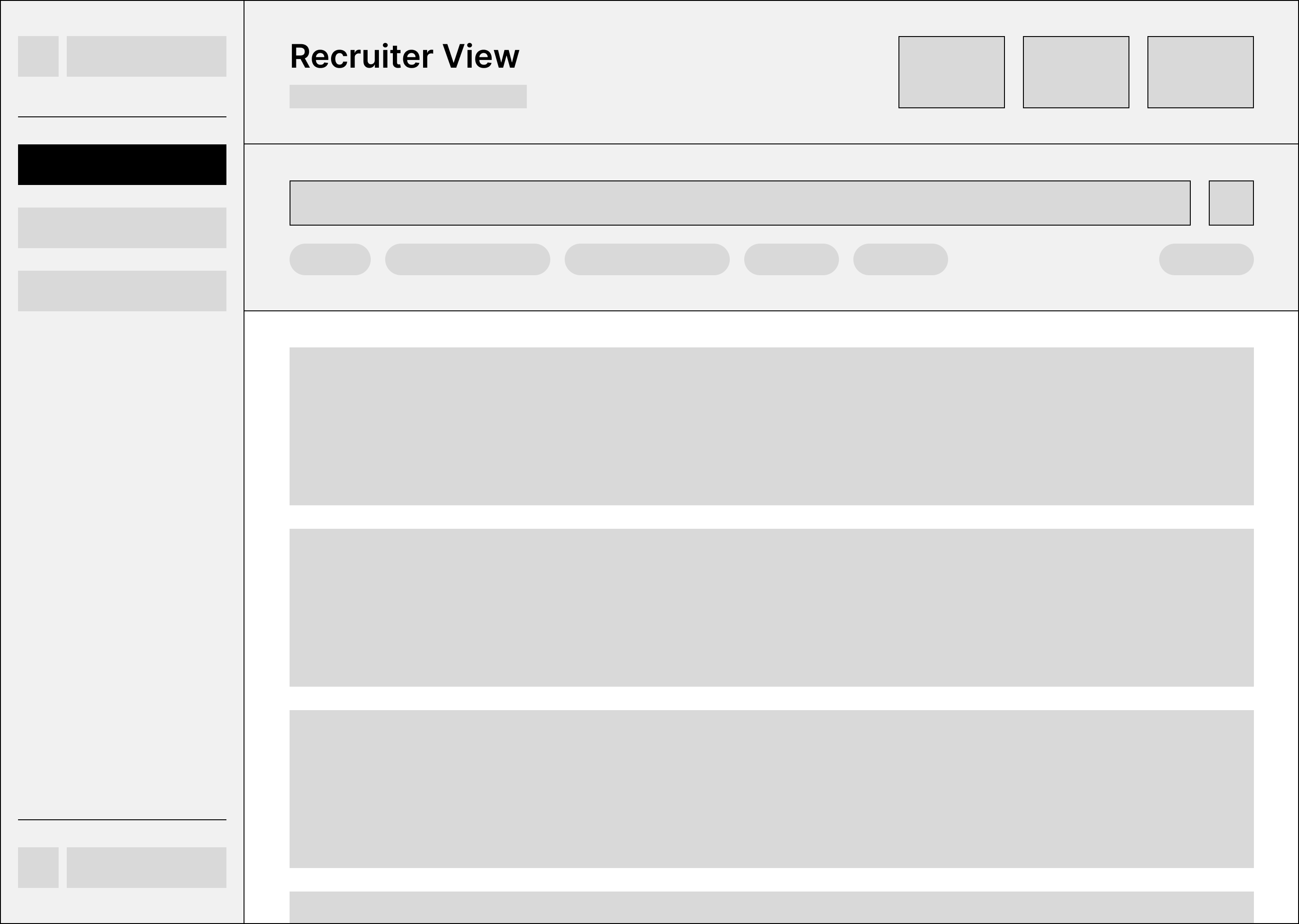
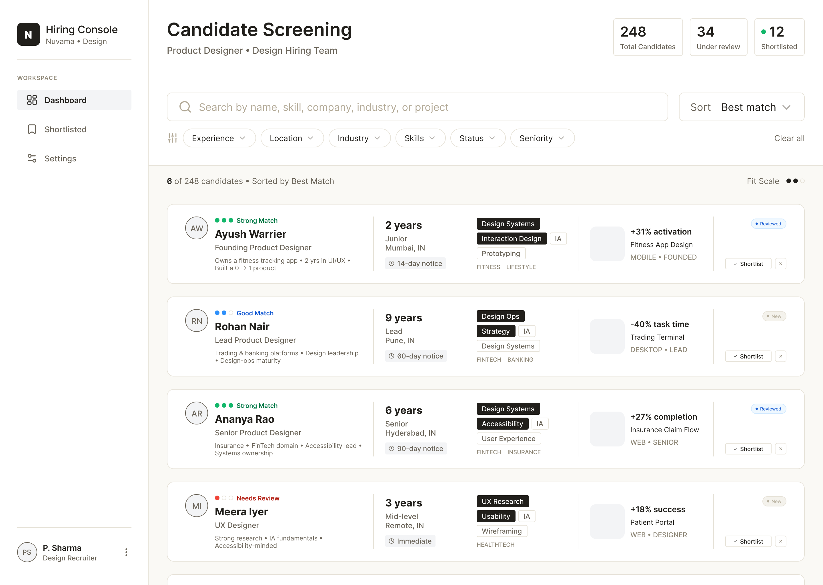
The information hierarchy was settled in wireframes first — what a recruiter needs, and in what order. Only once that held did typography, spacing and interaction details get refined.
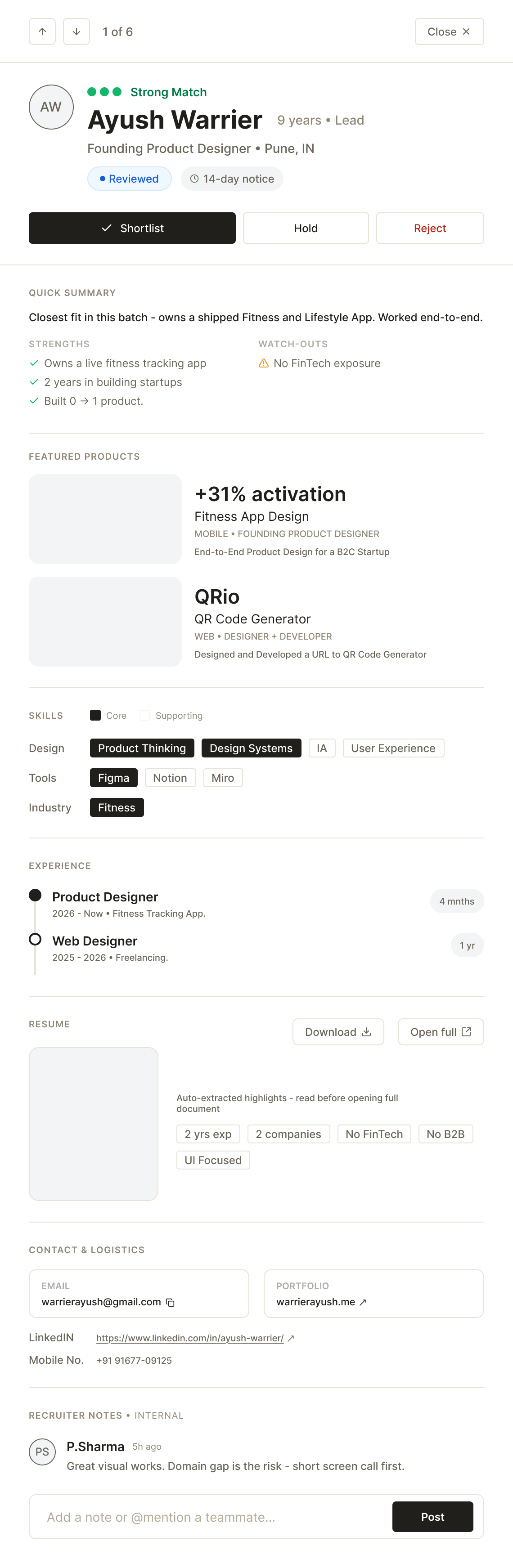
Information follows the recruiter's decision process
-
Header
Name, match strength, seniority and location — with Shortlist, Hold and Reject already in reach. The decision never waits for a scroll.
-
Quick Summary
One honest sentence, then strengths set against watch-outs. The recruiter gets the verdict before the evidence.
-
Featured Projects
Real work with the outcome attached, and the candidate's actual role named — so contribution is read, not guessed.
-
Skills
Core separated from supporting, in one shared vocabulary across design, tools and industry. This is what makes two candidates comparable.
-
Experience
A short timeline — role, dates, duration. Enough to see a trajectory, not a second resume.
-
Resume
Auto-extracted highlights sit above the document, so the full PDF is opened by choice rather than by default.
-
Contact & Notes
Email, portfolio and links last — next to internal notes, which turn one person's screening into a team decision.
AI in the Design Process
ChatGPT was used as a thinking partner throughout the assignment.
It helped challenge assumptions, discuss recruiter workflows, explore trade-offs and validate reasoning — the kind of back and forth I'd otherwise have with a colleague.
The interface, wireframes, interaction patterns and final decisions were designed manually in Figma.
What I'd Improve Next
The assignment answers the brief. The product wouldn't stop here.
- Color-coded hiring stages
- Saved recruiter views
- Bulk candidate actions
- AI-assisted candidate summaries
- Recruiter collaboration and notes
- Keyboard shortcuts for reviewing candidates faster